

CMYK and RGB are two different ways to build color, and the gap between them is why a design that glows on your monitor can print flatter than you expected. RGB is the color model screens use, built by adding red, green, and blue light. CMYK is the color model presses use, built by layering cyan, magenta, yellow, and black ink on paper. Screens emit light and ink absorbs it, so the two systems reach different colors. Learn the difference and your printed piece stops surprising you.
That is the whole game: get the color right before the press runs, not after. Ka-Pow!
Key Takeaways
- RGB builds color by adding red, green, and blue light. It is how screens display color, and a standard 24-bit screen can show about 16.7 million colors.
- CMYK builds color by layering cyan, magenta, yellow, and black ink, which absorbs light instead of emitting it, so its color range is smaller than a screen’s.
- Bright, saturated colors (neon green, hot pink, electric blue) often fall outside the printable range and shift when converted.
- Design for print in CMYK when color accuracy matters, and let prepress handle the conversion instead of sending raw RGB to a press.
- For brand colors that must match every time, spot (Pantone) inks reach colors that four-color CMYK cannot.
What is the difference between CMYK and RGB printing?
The core difference is additive versus subtractive color. RGB is additive: screens layer red, green, and blue light to build a color, and at full strength those three add up to white, as UC Berkeley’s color-science course material describes it. CMYK is subtractive: ink on paper masks, or subtracts, light from a white sheet, so adding ink moves the result toward black.
The size of each system is different too. A standard 24-bit RGB screen can display 16,777,216 colors, about 16.7 million, from 256 levels each of red, green, and blue, reference documentation on color depth confirms. Ink cannot emit light the way a screen does, so the set of colors CMYK can reproduce is both smaller and shaped differently. That is not a flaw. It is the reason a color chosen on a screen has to be translated before it can be printed.
Why do colors look different in print than on screen?
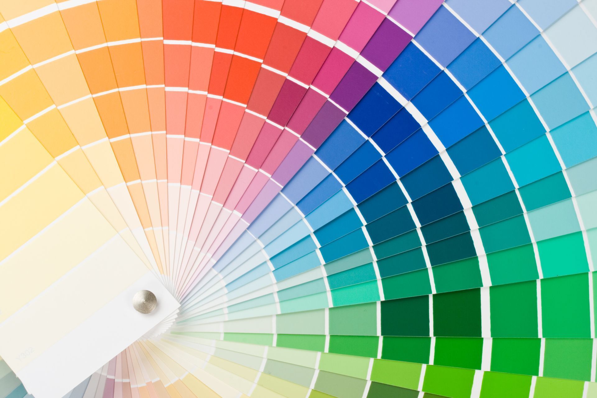
Colors change because some screen colors fall outside what ink can reproduce, a condition printers call out of gamut. As one commercial print resource puts it, certain bright shades seen on a digital screen simply cannot be reproduced with standard printing inks. When a file goes to a press, those colors are mapped to the nearest printable equivalent, which is why a vivid cyan or a neon green can come back calmer on paper.
This is physics, not a mistake at the press. Light on a screen can be more intense than ink on paper, so the brightest, most saturated colors are the first to shift. The team that catches this early is your printer’s prepress department. MPress’s own prepress process flags the same trap: a file that prints beautifully on a desktop printer can shift badly on press if it was built in the wrong color space. Knowing which colors are at risk before the run is what keeps the finished piece close to what you approved.
Screen versus press
Why the two will never match exactly
A screen emits light and mixes red, green and blue. A press absorbs light and mixes four inks.
Sources: color depth reference (24-bit true color); International Color Consortium, sRGB specification.
When should you work in RGB versus CMYK?
Design in RGB for anything that lives on a screen, and design or convert to CMYK for anything headed to a press. RGB is the right space for websites, video, and social graphics, because screens are RGB devices and you want the full, bright range they can show. For print, the safer workflow is to build in CMYK from the start, or to convert deliberately before you hand off files, rather than letting a press driver guess for you.
| Feature | RGB | CMYK |
|---|---|---|
| Full form | Red, Green, Blue | Cyan, Magenta, Yellow, Key (black) |
| Color method | Additive (light) | Subtractive (ink) |
| Best for | Screens, web, video, social | Print, packaging, direct mail |
| Color range | Larger; about 16.7M in 24-bit | Smaller; bright and neon colors limited |
| Where white comes from | All colors of light combined | The paper itself |
If you only ever hand off one file type, a print-ready CMYK file with any critical brand colors flagged saves the most surprises. If you are unsure, a printer can convert and proof for you before committing to a run.
How does professional prepress convert RGB to CMYK?
Conversion is a controlled prepress step, not an afterthought. Prepress is everything between the file you send and the plate or press that reproduces it, and it is where color is profiled and artwork is checked against how it will actually print. A color-managed shop does not convert by eye. It runs its presses to a numeric target so the result is repeatable.
MPress’s prepress department is aligned to G7 and GRACoL, the North American color standards developed by the PRINTING United Alliance and its Idealliance committee to keep color consistent and accurate from design to press. Running to that standard has a practical payoff: a proof you approve is what comes off the press, and a reprint next year matches the job you hold now. That consistency is exactly why brand-critical work such as lithographic offset printing holds color across a long run better than any other process.
What about brand colors and Pantone spot colors?
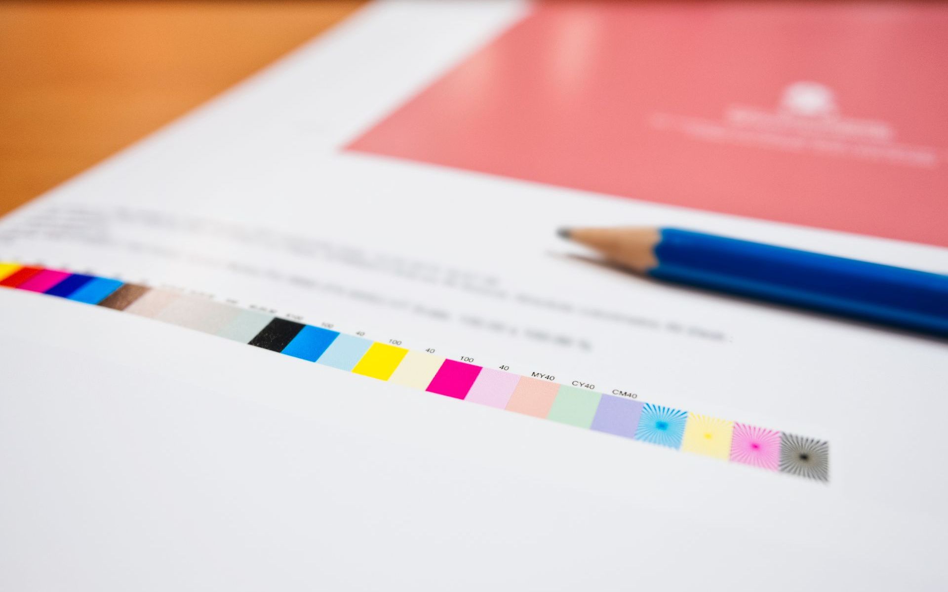
When a brand color has to be exact, spot (Pantone) inks reach colors that four-color CMYK cannot. A pure spot color is a single ink mixed before it touches paper. As the School of the Art Institute of Chicago’s service bureau explains, that pure spot color allows a wider range of reproduced colors than the CMYK spectrum, and converting a spot color to CMYK can yield a result you were not expecting.
For color-critical work, mixing the exact ink beats matching by eye. MPress manufactures ink in house, so a brand color is repeatable batch to batch rather than a near-match that drifts on the next reprint. That matters most on package printing and folding cartons, where a logo color that wanders from one production run to the next is worse than no reprint at all. If your brand guidelines list a Pantone number, tell your printer up front so the color is specified as a spot ink rather than approximated in process CMYK.
Does the printing method change the color?
The color model is the same across processes, but the method affects how faithfully bright colors survive. Offset printing holds color consistently across a long run, which is why packaging, catalogs, and brand-critical pieces run offset. Digital printing uses toner and liquid ink, is efficient for short runs and variable data printing, and lets you see a real printed proof before committing to a long offset run, so color is settled on paper rather than on a screen. Wide-format printing covers banners and signage, where viewing distance changes how a color reads at scale.
Whatever the method, the rule holds: convert to CMYK, or specify spot inks, before the run. That single decision is what keeps the printed result predictable instead of leaving it to a last-second automatic conversion.
A quick checklist for print-ready color
- Convert artwork to CMYK before handoff, or ask your printer to convert and proof it for you.
- Flag any brand colors that must match a Pantone number so they can be specified as spot inks.
- Expect bright RGB colors to soften in print, and pick in-gamut alternatives when a color is critical.
- Request a printed proof on color-critical jobs rather than approving on a screen.
- Include bleed and use print-resolution images (300 dpi) so the file holds up on press.
Not sure whether your file is press-ready? Send it over and our prepress team will check the color before anything runs. Upload a file at mpressnow.com/upload-a-file, request a quote at mpressnow.com/request-a-quote, or call (504) 524-8248. BANG!
Frequently Asked Questions
Should I design in RGB or CMYK for printing?
Design in CMYK for anything that will be printed, or convert to CMYK before you hand off files. RGB is built for screens and can display colors that ink cannot reproduce, so a print-ready CMYK file gives you the closest match to what the press can actually produce.
Why do my printed colors look duller than on my screen?
Screens emit light and can show very bright, saturated colors that sit outside the printable range. When those out-of-gamut colors are converted for print, they are mapped to the nearest ink equivalent, which usually reads as slightly calmer than the glowing version on your monitor.
Can you print an RGB file?
A press only prints in CMYK (plus any spot inks), so an RGB file has to be converted first. If you send RGB, an automatic conversion happens somewhere in the workflow, and the safest result comes from converting and proofing deliberately in prepress rather than leaving it to a default.
What is a spot color, and when do I need one?
A spot color is a single premixed ink, most often specified by a Pantone number. You need one when a brand color has to match exactly every time, or when the color is too bright or saturated for four-color CMYK to reproduce reliably.
What does prepress do to my file?
Prepress checks color space, resolution, bleed, and separations, and converts the file to the press’s color target before anything is printed. It is the step that catches problems while they are still cheap to fix, rather than after the ink is on paper.
Sources
- UC Berkeley, Introduction to Color Science (CS184)
- PRINTING United Alliance / Idealliance, GRACoL specifications
- School of the Art Institute of Chicago Service Bureau, Using CMYK vs. Pantone (PMS)
- Color depth reference (24-bit true color)
- International Color Consortium, sRGB specification
About MPress: MPress is a commercial printer running lithographic offset, digital, wide-format, direct mail, packaging, and finishing in house, with plants in New Orleans, Louisiana and McKinney, Texas. Questions about color or file setup? Call (504) 524-8248.